I imagine that some of us may be aware that there has been some bug going around, called Covid19?… (I know, probably too soon for humour on that)
The stock market can often be a beast and cut many of the newer (and even some of the longer standing) traders, down.
A Black Swan event like this current one comes in and totally rocks the boat. Add to that the Presidential elections, and yes, even Brexit will cause a slight ripple to it, and we would imagine that it would be tantamount to trying to navigate a dingy through rapids!!
You could be forgiven if you thought the above as there are quite a few events that would cause it to bounce about.
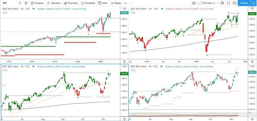
One of the best and easiest ways to get a proper picture of what is going on is via a 4 chart system. I know, I haven’t mentioned a system that discusses fundamentals, (though I did quickly mention the actual events, further up)
The 4 chart system I am using is bespoke and has been specially designed to rule out all the noise (fundamentals etc) from the market and just give me the chart data, also known as, the technicals.
The top-left chart shows the SP500 from a Monthly standpoint.
The top-right shows it from a Weekly angle
Bottom left is Daily
Bottom right is Daily, though also gives extra data so that I have a better understanding of things like Volume and a few other quick-scan tools in there.
So, by looking at this, we now have a pretty good all-round picture of the SP500 and have a good idea of what is going on.
If you look at the top left, Monthly, you will notice the dip just after 2020, this is around Feb to March, we see some deep red candles.
As we know, this is the Covid19 dance, but look at what happened from April onwards, it soon pulled itself out of this fall and got itself back on track.
Sticking with the top left, Monthly, what else do we see?
Well, if you look at Jan and Feb, we see a small and a bigger red bar as it had made 2 attempts at pushing itself through and trying to create a new high point.
After the Covid19 dip, it came back and pushed through this area of Resistance it had found in Jan and Feb and is now using it as an area of Support. If you look at Aug, Sept, Oct and so far, Nov, they are all bouncing on that bar as they use it as Support.
Of course, they could crash through that Support area and start falling down, but (so far) the fact that it is bouncing off it and going into a period of consolidation (consolidation just means that it is going sideways), is actually a good sign.
This is where a patient trader would sit back and wait to see what happens next, before stepping up to the plate and placing their trade.
This is also were a “gamble-trader” will try to catch the trend at the very beginning and just place their investment. I say, gamble-trader, because at this point, which way is it going to go? Nobody knows this and so a patient trader would wait until the charts have given us the information we need and then we step into the trade.
Now at this point, one could argue that maybe if we knew the fundamentals and knew what was going on within the stock market, we would be better placed to place the trade, and surely that would return more profits than waiting for the stock market to make its next move?
Yes, if you got it right, it would return more, but that is the gambling part, right there.
The important thing to remember is that Stock Market Trading, is not a science and it is our job to take out as many variables as we can so that we can stack it more in our favour.
Ok, at this point, if you haven’t yet nodded off, you are probably thinking – “Dude, you’re running a 4 chart system and have only touched on the top left!!”… (if you actually called me “dude”, I’d be well happy, so I’m sticking with that)
If we have a quick scan of the bottom left Daily chart, we can see straight away that the high on 2’nd Sept, was also tested again on 9th Nov, though it does have a candle wick that pushes through it, so even though it was tested, it fell down to it’s 2’nd Sept, high. And, we can also see that presently, it is close to being tested again today, 11th Nov.
In less than a minute, we have a pretty good understanding of what the S&P500 is doing, where it has been tested, where it has broken its Resistance zones and created new Support zones.
Actually, to a momentum trader, they would analyse all 4 charts within a minute, and that includes, zooming in, looking at volume, pivotal levels (pivotal levels give us an idea of the strength of the trend)
I am not going to give a break down of the other 2 charts as that would turn this into a novel!
So, I guess the next question here could be – How can this information best serve me?
This depends on how you trade. If you were trading the entire SP500, then a good idea may be to wait until certain trends have started to form again before stepping up to the plate.
Or, if you were trading certain stocks within the USA, then knowing how the SP500, in general, is performing, could help you rule out some loose ends and give you a clearer picture of your desired stock is worth, or ready to be traded.
I hope that this has helped and given people a basic idea of how to analyse the SP500 via technicals and without the noise.
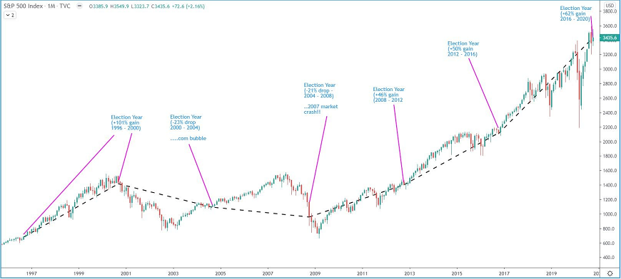
BONUS: As a bonus, I have also attached the SP500 showing it over the Presidential election years so that people can get an idea of what it does during those times, also… … (I’m nice like that, lol!)
There are many ways to trade the markets, two of the most common we see are Fundamental Trading and Momentum/Trend Trading. I have used both and have found that one can return bigger gains than the other when followed properly. If it is something that you think may interest you, just leave me a message and I am happy to help point you in the right direction or help you understand the methods I use for this…
Please Read More